
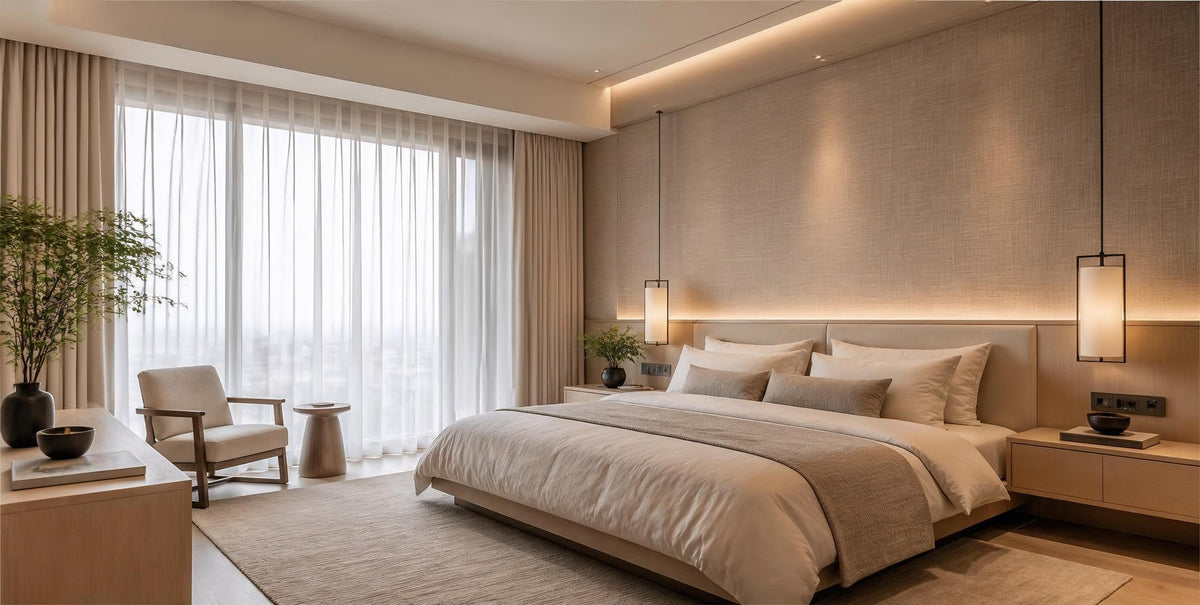
Neutral Wallpaper Singapore: Colours & Interior Ideas

Neutral does not have to mean plain.
In BTO flats, resale HDB homes, condominiums and landed properties, neutral wallpaper can create a calm backdrop while allowing furniture, flooring, carpentry, artwork and lighting to become the stronger visual elements.
The difference between an ordinary neutral wall and a well-designed one often comes down to undertone and texture. A warm oatmeal linen effect, soft plaster-inspired beige or subtle greige weave can add depth without introducing a pattern that dominates the room.
Quick Takeaways
- Neutral is a family of colours: warm white, cream, beige, oatmeal, greige, taupe and soft grey can all create very different interiors.
- Undertone matters: the same wallpaper can appear warmer or cooler depending on daylight, room orientation and artificial lighting.
- Texture adds character: linen, woven, plaster, stone and fabric-inspired finishes can give neutral walls more depth than a completely flat surface.
- Test before deciding: view physical samples beside your flooring and carpentry under the actual room lighting whenever possible.
Looking for a neutral wallpaper for your Singapore home? Visit the MONLI showroom in Tampines to compare physical samples, or WhatsApp +65 8112 4866 to discuss your interior.


What Counts as Neutral Wallpaper?
Neutral wallpaper extends far beyond plain white or beige.
Some neutrals have yellow, cream or brown undertones and feel naturally warm. Others contain grey or stone undertones and create a cleaner, more contemporary appearance.
Understanding these differences is important because two wallpapers that look similar in a catalogue can appear noticeably different once installed in a real Singapore home.
Warm White & Ivory
Warm white and ivory provide brightness without the stark appearance that some pure whites can create.
They work particularly well in compact bedrooms, hallways and living areas where homeowners want a light interior while retaining some visual warmth.
Beige, Sand & Oatmeal
Beige-based neutrals have an earthy quality that pairs naturally with timber, rattan, warm stone and soft fabrics.
Oatmeal and sand tones are particularly useful for Japandi, Scandinavian and contemporary interiors where the design depends on subtle layers rather than strong colour contrast.
Greige
Greige combines elements of grey and beige.
Depending on its undertone and the surrounding lighting, it may appear warmer in the evening and more grey during brighter daylight hours. This flexibility makes greige useful in rooms containing both warm timber and cooler materials such as stone, metal or grey upholstery.
Taupe & Mushroom
Taupe generally sits deeper than beige and can contain brown, grey or muted earthy undertones.
It works well when you want a neutral room with more visual weight, particularly for master bedrooms, dining areas and sophisticated living-room feature walls.
Soft Neutral Grey
A soft grey can still function as a neutral, especially when it avoids a strong blue or green cast.
It is a useful bridge between warm timber carpentry, black detailing and contemporary stone surfaces.
Beige vs Warm White vs Greige vs Taupe
| Neutral Tone | Overall Character | Works Well With | Popular Applications |
|---|---|---|---|
| Warm White / Ivory | Light, clean, soft | Light timber, pastel accents, warm whites | Compact bedrooms, hallways, living rooms |
| Beige / Sand | Warm, natural, welcoming | Oak, rattan, cream upholstery, brass | Living rooms, bedrooms, dining areas |
| Oatmeal | Organic, understated | Natural timber, linen, off-white furniture | Japandi and Scandinavian interiors |
| Greige | Balanced, contemporary | Walnut, black trims, stone, grey upholstery | Condos, open-plan living, TV walls |
| Taupe / Mushroom | Deeper, sophisticated, earthy | Dark timber, bronze, warm lighting | Master bedrooms, dining rooms, feature walls |
Choosing Neutral Wallpaper for Singapore Lighting
Lighting is one of the most important factors when choosing a neutral wallcovering.
Singapore homes may receive strong daylight through large windows during the day, then rely almost entirely on warm or cool LED lighting at night. A wallpaper selected under showroom lighting can therefore look different once installed.
Rooms with Strong Natural Daylight
Bright rooms give you more flexibility, but very light neutrals can sometimes appear brighter than expected near large windows.
Subtle texture can add visual definition, while beige, oatmeal, greige and other muted tones can provide contrast without making the space feel heavy.
Rooms with Limited Natural Light
In darker bedrooms, corridors or internal spaces, lighter warm neutrals can help maintain a brighter visual impression.
Before choosing a deeper taupe or grey-neutral, check how it looks under the room's actual artificial lighting.
Warm LED Lighting
Warm lighting can make beige, cream, oatmeal and taupe appear richer and warmer.
It can also change the appearance of greige, so sample testing is especially useful if the room uses warm cove lighting or decorative pendant lights.
Cool or Neutral-White Lighting
Cooler lighting can make certain grey-based neutrals appear crisper while reducing some of the warmth in beige-based colours.
There is no universal "correct" combination. The goal is to evaluate the complete palette together rather than choosing the wallpaper in isolation.
Choosing Neutral Wallpaper by Room
| Room | Neutral Direction | What to Consider |
|---|---|---|
| Living Room | Beige, oatmeal, greige, soft taupe | Flooring, sofa colour, TV carpentry and daylight |
| Master Bedroom | Warm beige, taupe, textured greige | Headboard, bedding and evening lighting |
| Small BTO Bedroom | Warm white, cream, light oatmeal | Keep the overall palette visually light and balanced |
| Dining Area | Sand, mushroom, warm greige | Dining table timber tone and pendant lighting |
| Home Office | Greige, soft stone, neutral grey | Desk carpentry, screen background and lighting |
| TV Feature Wall | Textured beige, greige, taupe | Screen contrast, console colour and surrounding lighting |
Looking for more distinctive neutral textures? Explore the MONLI Wallpaper Atelier collection.


Pairing Neutral Wallpaper with Flooring & Carpentry
One reason neutral wallpaper works so well is its ability to connect multiple interior materials without competing with them.
Light Oak & Scandinavian Timber
Warm white, oatmeal, sand and light greige create a soft transition into pale timber flooring and cabinetry.
This combination works particularly well for Scandinavian and Japandi interiors where visual calm is created through similar but not identical natural tones.
Walnut & Dark Wood
Dark timber creates stronger contrast against warm beige, mushroom and greige walls.
A lightly textured neutral wall can help prevent dark carpentry from making the entire interior feel visually heavy.
Black Frames & Metal Details
Greige, stone and warm off-white provide a clean background for black aluminium, dark shelving and modern metal details.
Stone, Marble & Sintered Surfaces
When the room contains visually active stone veining, a quieter neutral wallpaper can prevent the material palette from becoming too busy.
Bring a stone, laminate or flooring sample when comparing wallpaper whenever possible.
Neutral Wallpaper for Popular Interior Styles
Japandi
Choose oatmeal, sand, warm beige or subtle plaster textures. Pair them with natural timber, soft fabrics and restrained decorative details.
Scandinavian
Warm white, cream and pale greige work well with light wood flooring, simple furniture and plenty of natural light.
Modern Minimalist
Consider clean greige, stone-inspired textures or subtle warm grey. Texture provides depth without requiring a strong pattern.
Modern Luxury
Deeper taupe, mushroom and refined fabric-inspired neutrals can complement walnut, stone, brushed metal and layered architectural lighting.
Wabi-Sabi
Muted earthy neutrals with plaster, mineral or irregular organic textures can create the imperfect, natural character associated with this style.
Texture Matters as Much as Colour
Two wallpapers in almost the same beige can create very different rooms depending on their texture.
Popular neutral design directions include:
- Linen and woven-fabric effects
- Plaster and limewash-inspired textures
- Stone and mineral effects
- Grasscloth-inspired designs
- Fine geometric patterns
- Subtle vertical textures
- Soft abstract murals
For a restrained interior, texture can provide enough visual interest that a strong pattern is unnecessary.
Does Neutral Wallpaper Work in Small BTO & Condo Rooms?
Yes, but colour selection should still respond to the room.
Light warm whites, creams, beige and pale greige can help create a lighter, more open visual impression in compact spaces. This does not mean every small room must be light-coloured.
A deeper taupe or greige feature wall can also work effectively when it is balanced with lighter adjacent surfaces, appropriate lighting and simple furniture.
In small spaces, scale matters too. Fine textures and restrained patterns are generally easier to integrate than oversized, high-contrast designs.
Neutral Wallpaper vs Neutral Paint
Both wallpaper and paint can create excellent neutral interiors, but they produce different visual effects.
| Factor | Neutral Wallpaper | Neutral Paint |
|---|---|---|
| Texture | Can provide woven, plaster, fabric and other decorative effects | Usually provides a more uniform surface unless a specialist finish is used |
| Pattern | Can incorporate subtle graphics, texture and murals | Primarily colour-based |
| Maintenance | Depends on wallcovering construction and care instructions | Depends on paint type, sheen and formulation |
| Wall Preparation | Requires a suitably prepared, stable substrate | Also requires appropriate preparation for a good finish |
| Future Changes | Removal depends on wallpaper, adhesive and substrate | Can normally be repainted with suitable preparation |
Choose wallpaper when texture, pattern or material character is important. Choose paint when a simple uniform colour finish is the main objective. Many Singapore interiors successfully use both.
Neutral Wallpaper & Singapore's Humid Climate
Singapore's warm and humid environment makes wall condition and installation important regardless of wallpaper colour.
Neutral wallpaper itself does not solve a moisture problem. Before installation, walls should be checked for issues such as:
- Active seepage
- Persistent dampness
- Mould
- Loose or peeling paint
- Powdery surfaces
- Significant cracking
- Old adhesive residue
If an underlying moisture problem exists, identify and rectify the cause before installing a new decorative wall finish.
Material construction, backing, adhesive, ventilation and site conditions can all influence long-term performance.
How to Test Neutral Wallpaper Before Ordering
Neutral shades can be surprisingly sensitive to their surroundings, so sample testing is particularly important.
Before making your final choice:
- Place the wallpaper sample against the actual wall
- View it in morning and afternoon daylight
- Check it again with the room lights switched on at night
- Compare it directly with flooring
- Place it beside carpentry laminate or timber samples
- Check it against sofa, curtains and major fabrics
- View it from across the room, not only at close range
- Consider the texture under both direct and indirect lighting
This is often more reliable than trying to select the "perfect beige" from a phone or computer screen.
Common Mistakes When Choosing Neutral Wallpaper
Assuming All Beige Looks the Same
Some beige wallpapers contain yellow, pink, grey or brown undertones. Those differences become much more visible beside flooring and cabinetry.
Choosing the Wallpaper Before the Carpentry
If custom cabinetry occupies a large part of the room, coordinate the two finishes rather than selecting them independently.
Ignoring Evening Lighting
A neutral selected in daylight can look substantially warmer or cooler once the room relies on artificial lighting.
Using Too Many Similar Neutrals
Layering neutral colours can look sophisticated, but slightly mismatched undertones may make the palette feel accidental. Compare samples together before finalising the scheme.
Choosing Colour but Ignoring Texture
A neutral wallpaper can still become visually dominant if the texture, sheen or pattern is too strong for the surrounding interior.
Using Wallpaper to Hide Wall Problems
Wallpaper may visually soften minor surface variation depending on the design, but it should not be used to conceal dampness, unstable paint or significant cracks.
Frequently Asked Questions
What is the difference between beige, greige and taupe wallpaper?
Beige generally has warmer cream, yellow or brown undertones. Greige combines grey and beige for a more balanced appearance. Taupe is usually deeper and may contain both brown and grey undertones. The exact appearance varies by product and lighting.
Does neutral wallpaper make a small BTO room look bigger?
Light warm whites, creams and pale neutral tones can help create a brighter and more open visual impression, especially when combined with suitable lighting and lighter furniture. Room proportions and the overall design still matter.
Which neutral wallpaper works best with light wood flooring?
Warm white, oatmeal, sand, beige and selected greige tones often coordinate well with light oak and Scandinavian-style timber. Compare physical samples because wood undertones vary considerably.
Should I choose beige or greige for my Singapore home?
Choose based on the complete material palette rather than the colour name alone. Beige usually creates a warmer effect, while greige can provide a more balanced transition between warm timber and cooler stone, metal or grey furnishings.
Is neutral wallpaper suitable for every room?
Neutral colours can work in almost any room, but the wallcovering material itself must still be appropriate for the location. Areas with higher moisture, frequent cleaning or unusual environmental exposure may require different product specifications.
Can neutral wallpaper be cleaned?
Cleaning depends on the selected product. Many coated or vinyl-surfaced wallcoverings allow some form of wiping, while delicate textured materials may require gentler care. Always follow the manufacturer's instructions for the specific wallpaper.
Related Wallpaper Guides
- Grey Wallpaper Singapore — Colour Guide
- Scandinavian Wallpaper Singapore — Style Guide
- Vinyl Wallpaper Singapore — Complete Buying Guide
- Wallpaper vs Paint Singapore — Which to Choose?
Find the Right Neutral Wallpaper with MONLI
The best neutral wallpaper is not simply the lightest beige or the safest colour. It is the tone and texture that works with your lighting, flooring, carpentry, furniture and overall interior style.
Compare warm white, beige, oatmeal, greige and taupe samples before deciding, and check them under the actual lighting conditions of your room whenever possible.
Explore MONLI's Wallpaper Singapore collection, visit our showroom at Stellar @ Tampines to compare physical samples, or WhatsApp +65 8112 4866 for product selection and a project quotation.
MONLI Interior Hub Pte Ltd
Showroom: 12 Tampines North Dr 4, #01-17, Stellar@Tampines, Singapore 529435
WhatsApp: +65 8112 4866
Visit our Tampines showroom to compare neutral wallpaper colours and textures alongside flooring and interior material samples.


Share:
Pink Wallpaper Singapore: Modern Interior Design Ideas
Eco-Friendly Wallpaper Singapore: What to Look For